Recruitment Agency Website Design: What Actually Converts in 2026

Most recruitment agency websites do very little. They look fine, list some jobs and a few sectors, and otherwise sit there. In a busy market that can be enough. In this one it isn't.
UK job postings are running around 32% below their pre-pandemic baseline, according to Indeed Hiring Lab vacancies are near their lowest since early 2021. Clients are better informed and quicker to push back on fees. When there's less work about, agencies compete harder to be found and to be trusted, and the website does a lot of that work. Here's what separates a site that brings in clients and candidates from one that doesn't.
Positioning comes before design
Design is the easy thing to obsess over and the wrong place to start. Before colour and layout, the site has to answer one question quickly for every visitor: are you the right agency for me?
A 'we recruit across all sectors' homepage answers that for no one, and the market is moving against it. Specialist agencies with real sector knowledge are commanding higher fees, and a lot of the fastest growing UK firms are the most focused rather than the biggest. Lead with the sectors and roles you actually own and the outcomes you deliver. Once that's clear, most of the design decisions make themselves.
Design for two journeys, not one
A recruitment site has two audiences who want opposite things, and most sites serve one of them well and the other badly.
Clients are looking for evidence you can deliver: sector expertise, results, and some reassurance that you know what you're doing. Candidates want relevant jobs and a quick way to apply. If a client has to scroll past job listings to find a way to contact you, or a candidate hits a 'request a quote' form when they only wanted to apply, you're losing people.
Split the two paths from the navigation down. A clear route for employers and a clear route for candidates, each with its own wording, its own proof and its own next step.
Get the job search right
If you advertise vacancies, the job search is the part of your site people use most, and it's where a lot of agencies lose candidates. Slow pages, filters that don't work, results that ignore location, and long application forms all cost you applicants, and the problem is worst on mobile, where most job hunting now happens.
A good job search is fast, has filters that actually help (sector, location, salary, contract type), and lets someone apply in a couple of taps rather than behind a registration wall. If job advertising is central to what you do, it's worth asking whether a bolt on plugin can really handle it or whether you need a proper dedicated recruitment website underneath. That decision also affects whether your roles show up in Google for Jobs, which depends on clean JobPosting structured data. A purpose-built platform handles that; a generic plugin often doesn't.
Speed and Core Web Vitals matter to rankings and conversions
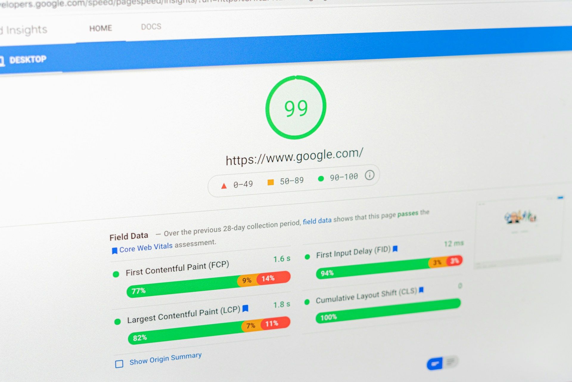
Site speed affects both where you rank and how many visitors convert. Google measures real-world experience through Core Web Vitals (loading, interactivity and visual stability), and a site that struggles on a mid-range Android phone will slip down the results and lose the candidate who gave up before it loaded.
Plenty of competitors ignore this, so it's worth getting right. Compress and size images properly, load fonts without blocking the render, and keep third-party scripts to a minimum. If a ranking dip hasn't recovered, a drop in Core Web Vitals after a redesign is one of the first things to check.
Show proof, not adjectives
Clients respond to evidence, and most agency sites give them adjectives instead: 'trusted', 'leading', 'bespoke'. Swap those for things you can show. Placement numbers, time-to-fill figures, named client logos, short case studies with an actual result, and testimonials attributed to a real person and role.
This matters more while the rules are changing. The Employment Rights Act and the April 2026 umbrella-company reforms are shifting how agencies operate, and clients want partners who clearly know what they're doing. A site that's specific about how you work will reassure a cautious buyer in a way a vague one won't.
Connect the website to your CRM
A website that's cut off from your back office makes work and loses placements. Vacancies get re-keyed by hand and go stale, live roles never make it online, and applications land in an inbox no one checks.
Integration fixes that. Vacancies should move from your recruitment CRM to the site automatically as soon as they go live, and applications should go straight back into your database against the right role and consultant. Your team does less manual work, applicants get a smoother experience, and search engines get the fresh, well-structured vacancy pages they like to index.
Build SEO into the site from the start
Ranking well comes from how the site is built, not from something you bolt on later. That means dedicated pages for each core specialism and location rather than one thin 'sectors' page trying to cover everything.
On top of that, an insights or blog section (like this one) keeps the site active and gives you material to rank for, link to and share. Aim it at where hiring has actually gone. With around 83% of UK employers now putting demonstrable skills ahead of formal qualifications, writing about how you assess and shortlist candidates will land better with hiring managers than a list of the roles you fill.
Make the next step obvious
Don't make people hunt for the action. Each page should have one clear next step for its audience: register a vacancy, upload a CV, or book a call. Keep forms short, since every extra field loses you a few more completions, and take out anything sitting between the visitor and what they came to do.
None of this is about a smarter-looking design. It comes down to clear positioning, two separate journeys, a fast and usable job search, measurable speed, real proof, and a site that's joined up to the tools you already run. That's the kind of recruitment website we build at Nodex.